01 / WebsitesFuller Function · Services

Give the work
a place to live.

Editorial websites, clear service pages and responsive web experiences. Designed and built by Josh Fuller around what people need to find and do.

For independent businesses, creators and small teams whose work deserves a clearer introduction.

In the workActual screens · desktop and phone

Three websites. Three different jobs.

A website is structure, voice and behaviour, not only a surface. Each of these starts from what its visitors need to understand and do.

01 / Introduce an idea

An editorial home for a product

Go Be Human

The separate website draft introduces a fixed activity library through decks, guides and printable resources. Genuine website imagery, distinct from its available web app.

  • Leads with one real activity and a reason to leave the screen.
  • Warm type and a fixed sample card adapt together as the page narrows.

Actual editorial website · undeployed draft, separate from the available web app.

Inside Go Be Human
Actual Go Be Human editorial website draft: One real thing. Then close the app, beside a fixed activity card.
Desktop
Actual Go Be Human editorial website draft at phone width, with its navigation, introduction and app action.
Phone
02 / Serve a community

A local voice, considered

WCLT

An independent website and platform concept. Responsive public-service pages connect a clear source boundary with an editorial presentation; station approval is pending.

  • The closings page names where its information comes from.
  • Representative data is labeled inside the screen, not in a footnote.

Independent website concept — pending station approval.

View concept
WCLT independent website concept, pending station approval: authored closings page explaining its source and proposed design.
Desktop
WCLT independent concept phone detail, pending station approval, with the original prototype-data warning.
Phone
03 / Hold a story together

A publication with its own atmosphere

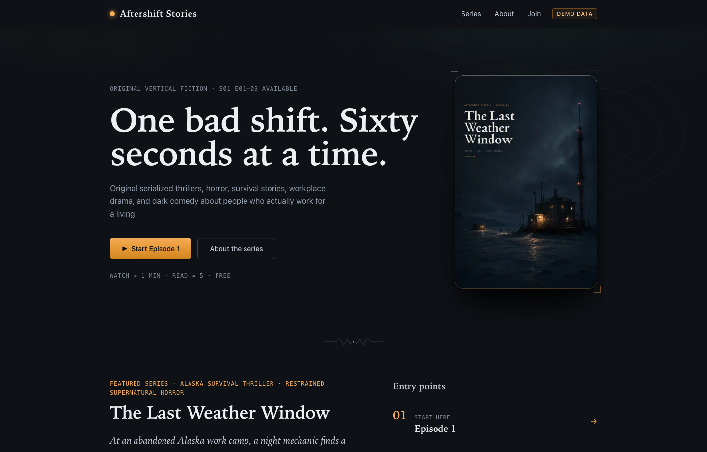
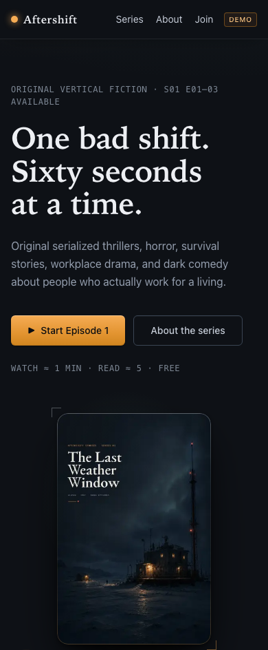
Aftershift Stories

A reader hub gives a fictional series a distinct visual identity, clear episode order and a reading experience that works on a phone.

  • Series identity, first episode and reading order share one page.
  • On a phone it becomes one column that keeps the first episode within reach.

Publishing MVP · in development. Fictional demo series; its campaign artwork was AI-generated under the owner’s direction and finished by the owner.

Inside Aftershift Stories
Aftershift Stories demo reader hub with an original fictional series, episode links and its existing illustrated campaign poster.
Desktop
Actual Aftershift Stories reader hub at phone width, showing its demo label, first-episode action and campaign poster.
Phone
How a project runsThree stages, agreed with you

From the first question to something useful.

  1. 01

    Find the story

    Sort the content, services and priorities. Give each page a purpose and each visitor a useful next step.

  2. 02

    Make it feel considered

    Shape typography, imagery and interaction around the work. Design the phone experience alongside the larger screen.

  3. 03

    Build the working site

    Connect the enquiry path, structure page information for search, and check loading, keyboard use and everyday maintenance.

A useful place to begin

Bring the work. We’ll find the shape.

  • Your current site, if there is one
  • The work you want to show
  • The action you want visitors to take

We can begin with a focused redesign or build the structure from scratch.

Let’s make
something useful.

Bring the idea you’ve been turning over. We’ll find a clear place to begin.

Start a project